How To Choose Color Palette For Your Website?
It is so crucial and creative when any designer thinks about how will choose a color palette for his website design.
What happens? When you have to interface with any website, then you like it for its attractive presentation and bright colors, and sometimes the website home screen may not inspire you.
You have to see many colors and combinations in daily life, but do you like all of them?
Some brand dress colors attract you, and you are motivated to purchase them.
Likely, when any website is prepared under specific guidelines with the color combination, then visitor does not land by chance or per click. However, the color attraction and the website presentation enable me to reach out to them often.
Don’t get in trouble; you can select a color palette for your website to follow these guidelines. So let’s start reading;

Choose a right color palette for your website
What is Color Palette?
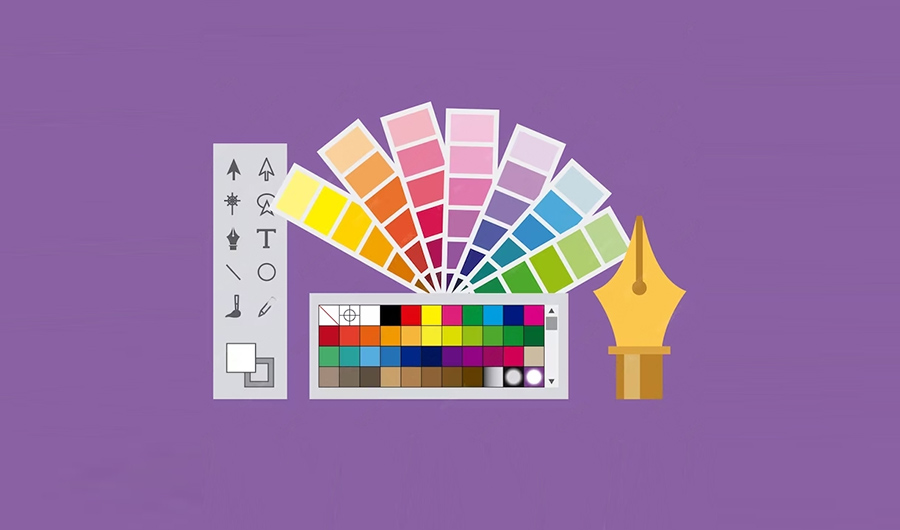
A color palette is a color policy that has to be used when any newbie website passes for creation.
The color palette is an essential element for website building and creation.
So it accepts the primary tool for the visual appearance of the website. Because on the base of it, the website is recognized around the globe.
What is Color Theory?
Before we discuss further, should know about the Color Theory and the Color’s basic guidelines.
Colors are a way of reflecting intensity, feelings, and mood. It is not simple to play with colors and turn them into natural beauty, ancient atmosphere, and modern trends.
Picking the colors, gradient to each other and invent the new one, the different shades of blue color, and the natural tone yellowish when the sunrises and set daily. This illustrates not only the ideas and creativity of the designer. But also the mastery of the graphic designer to show the natural tapestry and scene.
Basically, the colors are distinguished into three categories;
Primary Colors— It includes red, yellow, and blue colors.
Secondary Colors —- If two primary colors mix with the same quantity, get the secondary colors. Green, orange, and purple are the secondary colors.
Tertiary Colors— These are the colors created by mixing the primary colors with the secondary colors. Red-orange Yellow-Orange, Yellow–Green, Blue-Green, Blue-Violet, and Red-Violet are examples of Tertiary Colors.
What is a Color Scheme?
Color Scheme is the set of colors shown on the wheels and is also called the color palette.
These color schemes also reflect the shades of any color which may be turned into feeling, reflect the natural vibes upon the senses and build a strong relationship among the website and its visitors.
Types of color schemes
Professionals describe five types of color schemes;
- Analogous— Recognized each and specific color like black, and white.
- Monochromatic— One specific color with shades like Red colors with light and dark shades.
- Complementary– colors are the row colors in a Pallete wheel-like standing position, and two opposite Monochromatic make a Complementary color scheme.
- Triadic— Its terms refer to 3 sides. When the designer selects a monochromatic color line. It would be Triadic as Yellow, Orange, and Purple.
- Compound—- It offers to select more rows of the Monochromatic. Like, select any Monochromatic color scheme, then select the two more Monochromatic schemes that are placed against each other.
Colors Reflecting Qualities
Warm Colors–Colors are associated with feelings and emotions, so some colors enhance the excitement and charm of attraction. These are called warm colors like Red, Orange, and Yellow.
Cool Colors—Some colors make the cool and refresh the mind by reflecting the colors like blue, green, and violet.
Colors Natural Features and Symbols
- White— Symbol of purity and Innocence
- Black— Symbol of mystery, Fear, Evil
- Pink— Symbol of affection, Inner peace
- Red—Symbol of courage, Anger, and Love
- Blue—Symbol of stability, Inspiration, and Wisdom
- Yellow–Symbol— Energy, Friendship and some think Jealousy, Danger etc
- Orange– Symbol— Brightness, happy, and Joyful
- Purple– Symbol— Reality and Luxury
Procedure for Selecting the Color Pallete
Collection of data
Before you have to select the color palettes, it is required to know
- What is the website genre?
- What is its theme?
- Which types of visitors land there?
- What should the vision of the website be?
Management Opinion
Firstly, it should think about research, and collect data about the User experience and which types of color combinations visitors mostly like.
After preparing the manual of the data, it is the website management approach that what the management opinion and the decision about the brand and website look like in the world. So think about;
- What will the purpose of the website be?
- Which color combination they like to demonstrate on the website? It may be soft, bright, attractive, and charming colors and may be boring, dull, dark, and heavy in tone and shade.
- How should the background color itself be? Light? Or dark?
Designer Responsibility
After collecting the data and management opinion, the real task moves to shift to the designer. It is the designer’s responsibility to perform the task well and generate beautiful color combinations that are imaginative.
The designer’s role is not creative only, but also realistic because he can distinguish between the imaginative and the facts.
A designer knows well what is better with these colors or not?
Brand Recognition Color Scheme
When any website is introduced and presented in the virtual world with any specific color tone and combination.
Now color will showcase the theme and style of the brand. When the visitor visits, he knows about the tradition, and hence website colors make the brand itself and symbols for them.

For example– Green color and Flat illustrations are the brand colors and symbols of UpWork.
Evaluation of the Color Scheme
It is a key principle that pilot testing makes reliable the business goals. So you select any color scheme and theme for your website. So should be evaluated how it looks on different types of gadgets and devices.
Nature Behind the Website Branding and Color Scheme
If you are looking around the world, it seems that Nature manages itself with a color scheme, combination, contrast, and more. Based on this phenomenon, Designers seek opportunities for blending the colors and producing a real image of the various assigned tasks.
You can understand with these examples like;
We have discussed before that any Color palette is associated with the Website’s Brand Image such as which type of content and relevant material is shared on the website.
So fewer websites will appear mostly with specific color schemes. Like;
Artistic Website— As the title mentions, if anyone wishes to operate a website like this, he should use colors that look cool, balanced, trending, and natural scene.
Often Golden, Silver, Gray, White, Black, and Brown colors are frequently used. Maybe the shades and tone can be changed with other colors.
Organic Website— This type of website relates to organic food and relevant business, so should use original colors and shades of vegetables and fruits.
Green, Red, and Yellow will be used as attractive colors, and the background should be filled with light, and soft color combinations such as white.
Gaming Website— These websites relate to motivation, encouragement, and motivation. So demanded sharp, attractive, warm colors that helped younger gamers to complete the mission.
You will see that this website is often filled the dark color combinations and contrast.
Business Website— It relates to the business, so the color scheme is based on the natural looks with highlighting background fill of the light, and bright colors and contrast. This product highlights more and fulfills the business purpose.
Colors Scheme Generator Software and Tools
Technology makes simple everything nowadays, so you can also help with the various color generator tools for enhancing the website presentation. Such as;
- Adobe Color
- Colors
- Canva Color Palette Generator
- Khroma
- Material Palette
Final Thoughts
It is recommended that beginners can select the Color Pallette by trying the tool. But I suggest that if you have to introduce in the industry an online brand, whatever it would be, get help from professionals and designers. Experience does not waste the time, money, and attention. So keep the time, because it is the most precious thing in the world.


