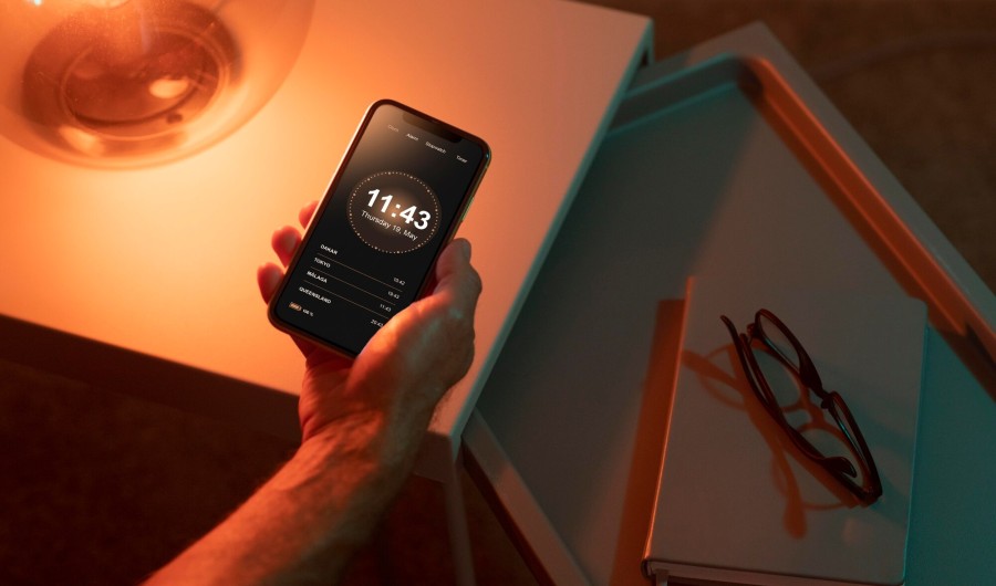
Enhancing User Experience: Strategies for Designing Dark Mode Interfaces
Dark mode design transcends mere trendiness; it stands as a functionality that improves user experience by minimizing ocular strain and preserving battery life, notably on OLED screens. Consider the following pivotal strategies in the creation of effective dark mode interfaces.

Comprehend the Fundamentals
Dark mode involves the inversion of standard light backgrounds to dark tones, mitigating the emission of blue light, known to induce ocular discomfort. This mode proves particularly advantageous in low-light settings and contributes to extended battery life on OLED devices.
Optimal Color Selection
Opt for darker shades of gray rather than absolute black for the background to avert high-contrast scenarios that strain the eyes. A dark gray background complemented by light text facilitates a softer contrast. Ensuring legibility is crucial through maintaining adequate contrast levels in alignment with Web Content Accessibility Guidelines (WCAG).

Prudent Employment of Accents
In dark mode, use bright colors judiciously to prevent overwhelming the user. Reserve them for pivotal elements such as buttons, links, and notifications to draw attention to significant features without causing discomfort.
Consistent Brand Representation
Preserve the integrity of your brand by adapting its color palette for dark mode without compromising its distinctive identity. Logos, icons, and other branded elements should remain easily discernible across both light and dark mode interfaces.
Diverse Environmental Testing
Conduct thorough testing of the dark mode design across varying lighting conditions, as what may appear optimal in dimly lit environments may prove less effective in bright daylight. User testing across diverse settings enables the gathering of feedback and subsequent adjustments as necessary.

Provision of Toggle Option
Offer users a readily accessible toggle to switch between light and dark modes as per their preference, thereby enhancing user satisfaction and accessibility.
Consideration of Animation and Effects
Tasteful employment of subtle animations and effects can augment the user experience in dark mode sans distractibility. It is essential to ensure seamless transitions between light and dark modes, steering clear of bright or swift animations that may undermine the calming attributes of dark mode.
Emphasis on Legibility
Typography assumes paramount significance in dark mode. Opt for fonts that afford readability against dark backgrounds, augmenting line spacing and shunning slender fonts exhibiting potential difficulty in legibility. Each textual element should be unmistakably clear and legible.
Optimization of Images and Media
Ensure the optimization of images and media for dark mode, guaranteeing that transparent PNGs and logos manifest no inadvertent backgrounds or halos when juxtaposed against dark backgrounds. The provision of alternate image versions that blend seamlessly with the dark theme is essential. As you plan the design of your dark mode, integrating the associated development costs into your strategy is pivotal. Understanding how much does it cost to make an app incorporating both light and dark modes is prudent, facilitating effective budgeting and ensuring a holistic design approach.

Development Costs Associated with Dark Mode
Incorporating dark mode features contributes to overall development costs. Typically, application development expenses range from $20,000 to $100,000 or more, contingent upon complexity. Integration of dark mode may elevate the budget by 10-15% owing to additional design, development, and testing requisites aimed at guaranteeing a seamless user experience across both light and dark mode interfaces.
Conclusion
The development of a user-friendly dark mode interface implicates the making of considerate design choices accentuating readability, usability, and aesthetics. Adherence to the strategies expounded herein facilitates the crafting of an immersive and visually captivating user experience. Whether in the process of developing a novel application or refining an existing one, adeptly designed dark mode can substantially elevate user satisfaction and engagement. Dark mode transcends transient trendiness; it presents itself as an invaluable feature enriching the collective user experience. By employing the strategies delineated, one ensures that their application is not solely visually appealing but functionally enriched, catering to audience preferences for both light and dark mode interfaces.


