How to Create User-Friendly Flowcharts for Web Design Projects
A web design flowchart conveys information in a clear and logical way. It is essentially a diagram that displays your workflow. A flowchart will help you to create a more intuitive user experience. Poor UX design can result in a lack of leads and conversions. When visitors have a good experience on a website, they tend to stay on it for longer. This makes them more likely to convert. Here are some tips and techniques for creating user-friendly flowcharts for web design projects.

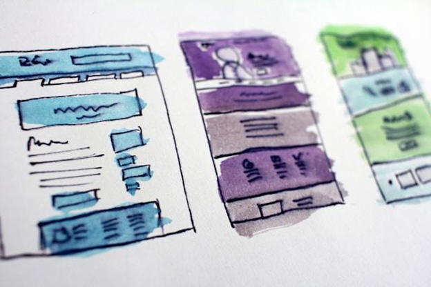
Image credit: Unsplash
What is a website flowchart?
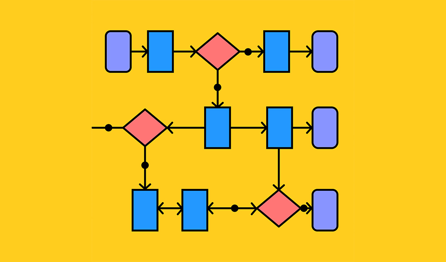
A website flowchart visually represents the structure of a website. There are many different types of website flowcharts, such as site maps, and user flow charts that show the path users take when navigating the website. There are also process flowcharts that show the different steps involved in a specific process such as registering on the site or checking out.
Why use website flowcharts?
When you have a visual diagram it helps you to identify potential obstacles early on in the design process.
- Plan and organize the structure of a website before you begin the design process.
- Communicate effectively with teams and make sure everyone is on the same page.
- Identify gaps in pages and content to make sure all information is included.
- Use as a reference for any future changes and updates.
- Help with strategic planning and aligning the intents of website visitors with achieving business goals.
How to create a flowchart
You can create a simple flowchart by using a whiteboard but this has limitations. It’s better to make use of specialized flowchart software. This enables you to easily collaborate and share your flowcharts. A basic way to create flow chart is to do so by using a template in Microsoft Word. You can also create a flowchart by using online flowchart software. If you’re a Mac user, the best tool for flowcharts is an app created specifically for a Mac. The best flowchart software for Mac includes apps like Diagrams and MindNode. They make it easy to create flexible and responsive flowcharts.
Define the website goals
When building a flowchart you are basically creating small, actionable steps. You will need to know who is using your site, their needs, and what problems they want to resolve, etc. Each step needs some detail but not so much that the flowchart is difficult to read. Keep the pathways as simple as possible and try to eliminate unnecessary steps.

Image credit: Unsplash
Identify the main website pages
You must identify the main pages of the website in the flowchart. These include the:
- Home page
- About page
- Contact page
- Product pages
Users must have a user-friendly experience on these pages or they are likely to quickly abandon a site. It’s important to consider the hierarchy of the website and use arrows to indicate the flow of information. Boxes can represent each page and arrows can show the relationship between them.
Add other pages and features
Your website flowchart should include additional sub-pages, menus, and forms. Add them to the website flowchart and connect them to the appropriate pages.
Map out user interactions
It’s crucial to create pathways that make any action users take on the website logical. For an online store, this usually involves choosing a product, adding it to a cart, and checking out. A checkout process should be seamless and smooth.
Website flowchart examples can help you to identify the most straightforward routes for users to perform certain tasks. For example, you can look at examples of good user flows for signing up to the site or subscribing to a newsletter.
Identify key decision-making points
Users have to make decisions about whether to register on a site, sign up for a newsletter, click on a call-to-action, or make a purchase. You need to give them clarity at each decision point and guide them to their goal. Remove any obstacles that could prevent them from making a decision and completing an action.
Use feedback loops
Feedback loops can reassure users or correct them to help them stay on track. This may consist of confirmation messages or alerts.
Test and iterate
It’s important to gather feedback and use it to refine a flowchart. This helps you to identify obstacles and remove them. For example, you can remove items that people don’t use from navigation and make important items like a call-to-action more visible. This could increase your conversions.
Conclusion
If you don’t use a flowchart for your web design projects, you don’t know what you need to optimize to offer users the best experience. Carefully considering users’ actions, goals, and decision points helps you to create a user-friendly flowchart. This will make sure that you offer users the best experience when using a site and you can achieve your business objectives.


